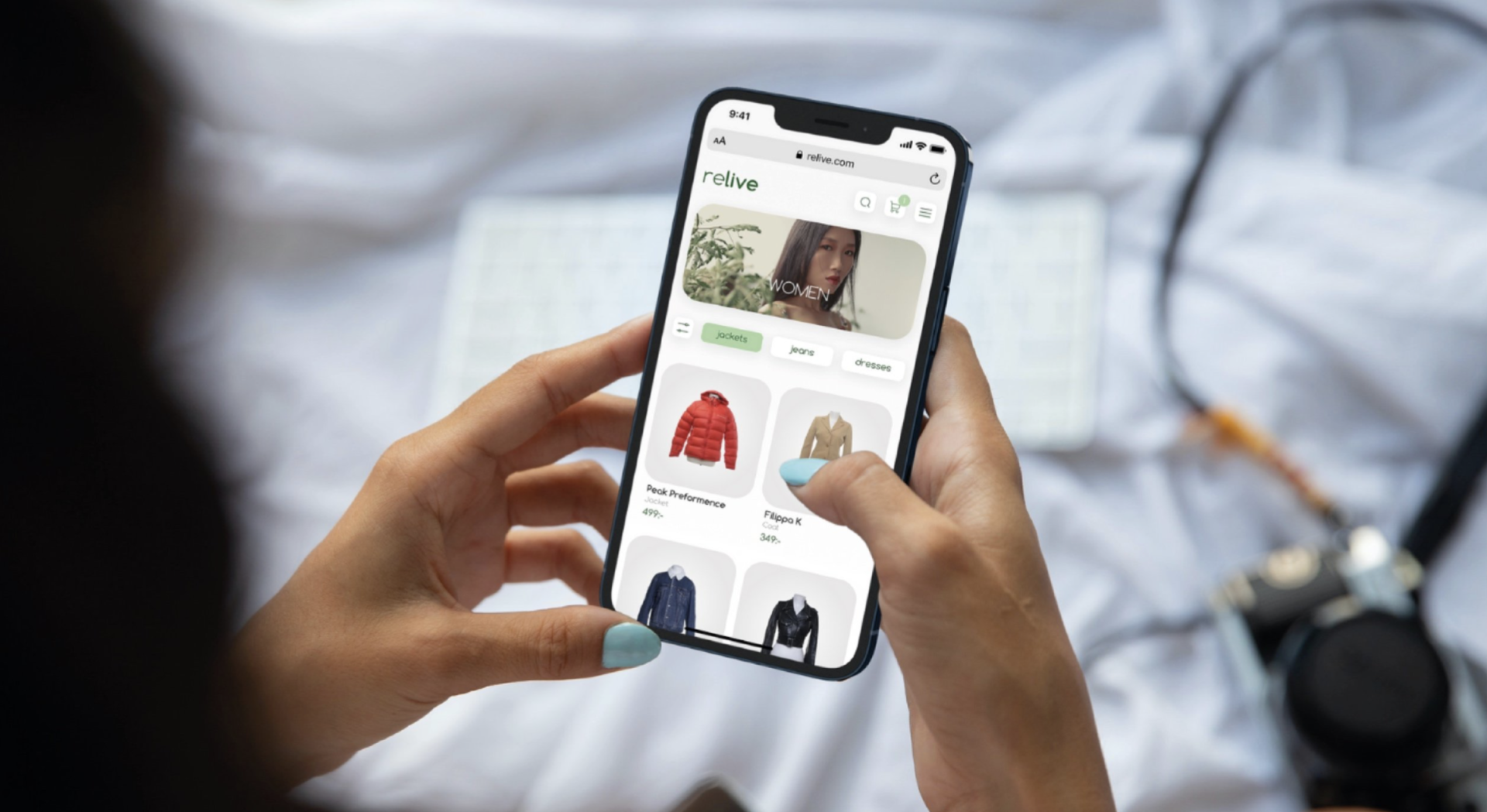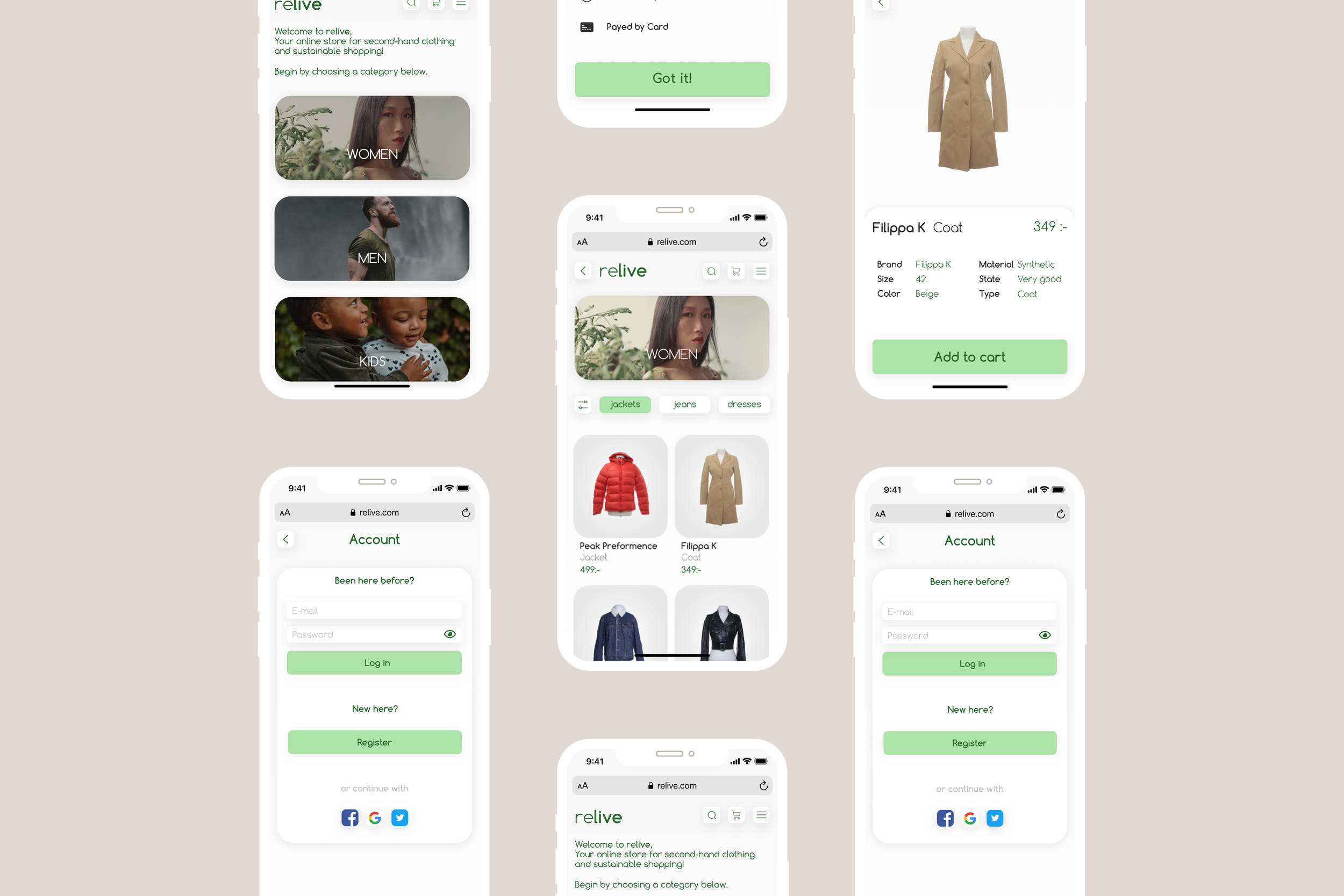
In this project me and my team designed an e-commerce for second hand clothing
-
Context
The fashion industry is one of the most polluting industries in the world, producing 20% of global wastewater and 10% of global carbon emissions – and it’s estimated that by 2050 this will have increased to 25%. The most successful fast fashion brands use influencers and other ploys to push trend-driven items at ridiculously low prices, all while producing new clothing collections as often as every two weeks. Yikes. That all comes at a huge cost to the lives of the workers who make the clothes, as well as the environment.
-
Impact
Our platform meets all standards for ecological, economic, and social sustainability. Together with actual users, we designed a user-friendly platform that simplifies trade for both individuals and businesses who wish to help and contribute to reducing carbon footprints.
-
Solution
An e-commerce platform that allows the reuse of garments that still has many years left in them. The website allows businesses and individuals to buy and sell used clothing, while also nudging the fashion industry to be more environmentally friendly.
Final Prototype
The Solution
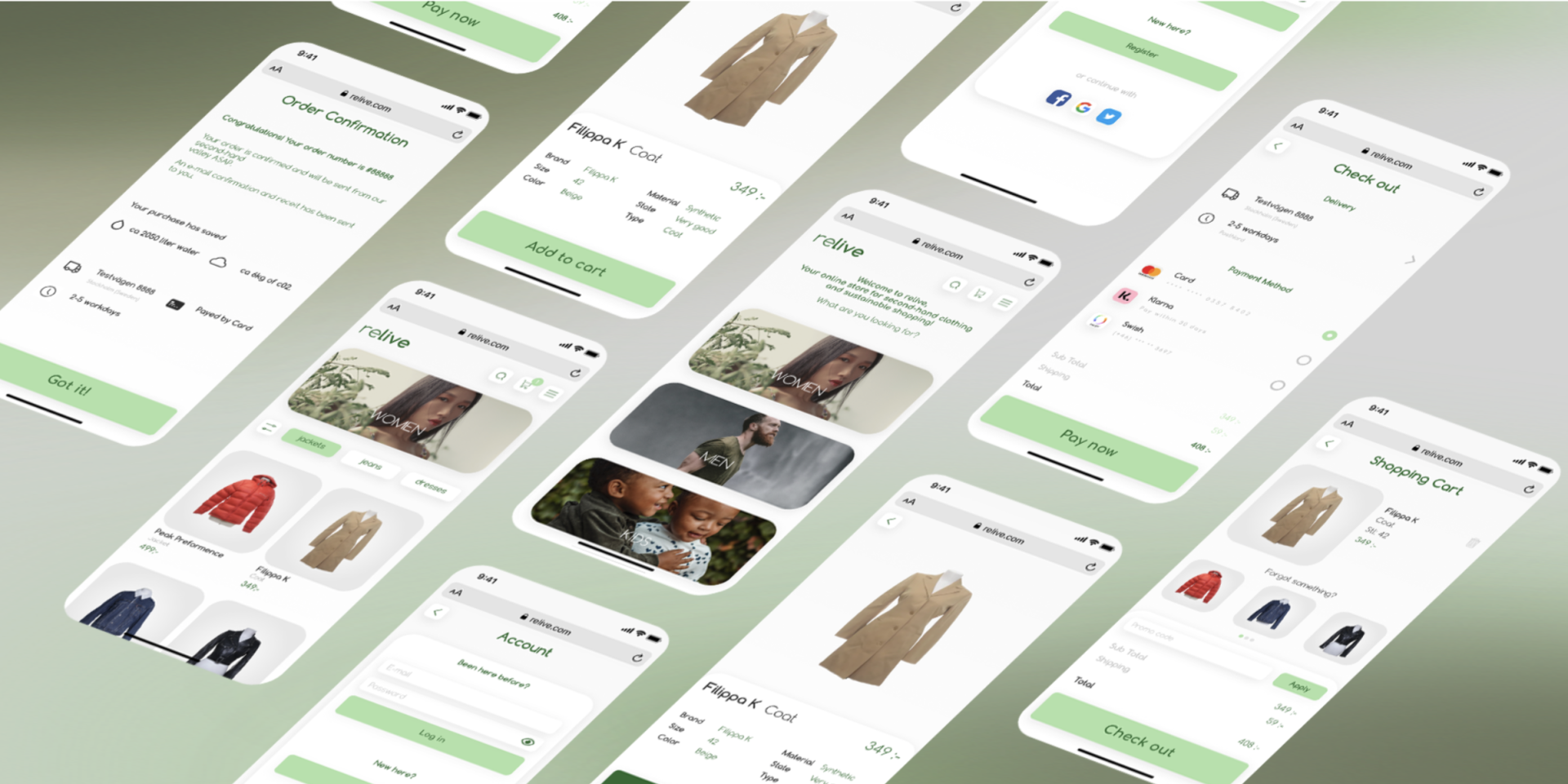
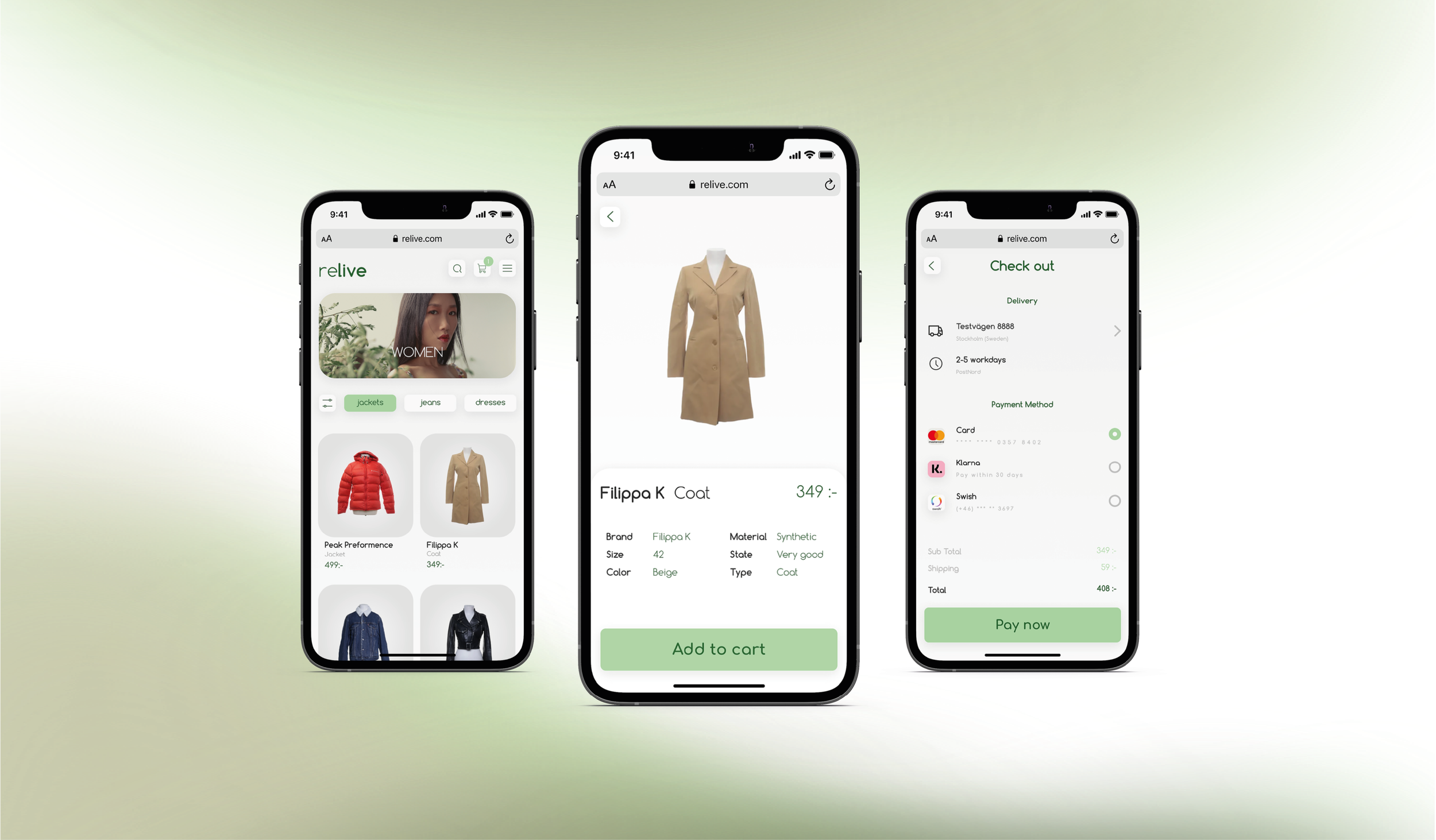
For the purpose of this project, there was 1 prototype created in Figma to create a first impression of the digital service. The images and below showcase a first version of the solution.

Project-details
Tools: Miro, Figma, Photoshop, Illustrator, Trello
Duration: 3 weeks
Target audience: Second hand retailers and fashionistas
My role: User & market research, UX design, User testing, UI design
Research
The Process
We started our project by interviewing 9 people about their shopping-habits to gain insights. We quickly saw that there was a stigma towards shopping second-hand.
We also did bench-marking and gathered studies from the three main perspectives on sustainability, which are ecological, economic, and social.
Needs
Users want to buy influencer-marketed, trendy clothes for low prices.
Buying second-hand feels dirty, un-organized and embarrassing.
Users would like to know the quality of products and estimated carbon print before purchase
Goals
A Second hand e-commerce with the look and feel of a trendy fast fashion e-commerce.
Informative product-pages that show quality and age of each product.
Show-case saved water & carbon print with every purchase.
Receive Karma-points with every purchase. Users should be rewarded for choosing sustainable shopping!
The Problem
Fast fashion refers to the relatively new phenomenon of rapidly producing high volumes of cheap, trendy clothing that match runway and celebrity styles. The idea is to get the clothes into the hands of the consumer as soon as an item becomes trendy; the consumer then only wears the item a few times before discarding it.
There are several key negative impacts of fast fashion’s rise in popularity. Mostly for environmental and ethical reasons; As a result, the desire for secondhand shopping and the ability to reuse old garments has grown in recent years, which is great! But how can we make it easier for businesses and consumers to sell and buy garments in a more sustainable way?
We began our project by interviewing 9 people about their shopping-habits to gain insights. We quickly saw that there was a stigma towards shopping second-hand. A lot of people avoid shopping second hand because it feels dirty and unorganized. They don’t trust the quality and it’s hard to find the right size. Some of the people we interviewed even thought it was embarrassing to buy second-hand clothes.
We asked ourselves: How can we fight this stigma through ReLive?
Define&Ideate
The Process
We used the JSQ method to uncover new innovative solutions in a systematic and convenient way. The method helped us define why secondhand retailers need an online sales platform, who the client is, and how we should implement our solution. JSQ provided us with an overview of the many options that may be included in our prototype.
The image below contains a flow used to explain the interaction designs in detail.
Wireframes&Prototypes
The Process
We created wireframes based on our user-flows and tested out different functions with testers to make sure that the usability was OK.(See image 1)
After our usability tests with simple wireframes we went on to create the UI for the service. (See image 2)
Usability testing
We contacted a total of 6 users who got to test our prototype. After our user tests, we compiled the test results into a table where we categorized the ambiguities encountered by the users.
The Process
We found a few painpoints and changes we wanted to make in our prototype after the tests.
After we had gathered all the insights, we created a bulletin board in Trello. In Trello we used a priority list where we prioritized the improvements we needed to make. Prio 1 were No Brainers that were quick to fix (like replacing the gender filtering). Prio 2 and Prio 3 were more long-term improvements that require more time, development and further testing. An example of this was how the Karma-point system would be used on business-users.
Usability test-findings
User interface
We brought our Mid-Fidelity prototype to life with the guidance of the insights from our usability tests.
We created a graphic manual for colors, typography, and components in order to generate recognizable characteristics across our platform.
Nature influenced the color palette, which includes several shades of green. However, due to the white tone, it is also quite light and airy. The green colors generate a sense of joy and harmony in the surroundings, as well as a pleasing overall appearance for both the purpose and the eye.
The Process
